|
|
Post by sukotsuto on Aug 17, 2007 19:03:42 GMT -5
A: DANCING BANANA LOLZ!!! 4.9/5
S: Cool sig! I'm now curious about that game 4.5/5
|
|
|
|
Post by miken-chan on Aug 20, 2007 16:32:49 GMT -5
A: 2/5 - It scares me...
S: 4/5 - It's really nice - but it's just not "my style" so to say...
|
|
|
|
Post by Riku on Aug 21, 2007 7:13:30 GMT -5
A: 4/5...It's the girl from ToD2 right? What was her name again...?
S: 4.5/5 OMG! Ar tonelico siggy!
|
|
|
|
Post by sukotsuto on Sept 20, 2007 21:54:27 GMT -5
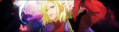
A: Wow it's Chloe! 9.3/10!!! S: I'm not familiar with the character in your sig though  7.7/10 |
|
|
|
Post by Hiro the Half-Elf on Sept 21, 2007 21:51:21 GMT -5
A: 3/5 He doesn't look too friendly, but that scar could be deceiving me.
S: 4/5 He's firing his hypno-beams at me! Augh!
|
|
|
|
Post by Tuxedo Pengu1n on Oct 15, 2007 12:59:07 GMT -5
AVATAR:5/5 Monks are the best
SIG:4/5 ..I had one alot similar to the one you have..But i dont use it xD
|
|
|
|
Post by Dede on Oct 15, 2007 13:02:18 GMT -5
Avatar: 0/5 You don't have one.
Sig: 4/5 It's awesome.
|
|
|
|
Post by Tuxedo Pengu1n on Oct 15, 2007 16:04:48 GMT -5
Sig 4/5 ITS spada =o
Avatar:4/5
|
|
|
|
Post by sukotsuto on Oct 16, 2007 9:06:31 GMT -5
A: An invisible avatar! Or not... ?/5 S: Mario pop art? Or bloody mario?  Nonetheless 4/5 |
|
|
|
Post by Dede on Oct 16, 2007 9:28:51 GMT -5
Avatar: 3/5
Sing: 4/5 *dances*
|
|
|
|
Post by Tuxedo Pengu1n on Oct 17, 2007 23:18:05 GMT -5
Sig= 8/10 simple and nice
Avatar:Dont see it
|
|
|
|
Post by desenderterresia89 on Oct 22, 2007 13:27:04 GMT -5
Sig: 5/10 too red
Avatar: None there
I'm Next!!
^-^
|
|
|
|
Post by LY on Dec 2, 2007 18:49:23 GMT -5
I dont want this thread to die! A: 2/5 Weird  S: 4/5 Text doesnt match. |
|
|
|
Post by desenderterresia89 on Dec 3, 2007 10:38:56 GMT -5
^ how is my avi wierd and Tuxedo Pengu1n made the sig si i don't know what font he used
avi 1/5 creepy
sig 2/5 still creepy
|
|
|
|
Post by miken-chan on Dec 3, 2007 16:50:04 GMT -5
(Rikku...creepy?)
Avi: 1/5 The text is barely visible to my blind eyes and there's that white outline that detracts from the smoothness.
Sig: 2/5 There's the white outline again around Judas...and the text may do better with a stronger outline/stroke.
|
|


 7.7/10


 Nonetheless 4/5

